Monday, 20 August 2012


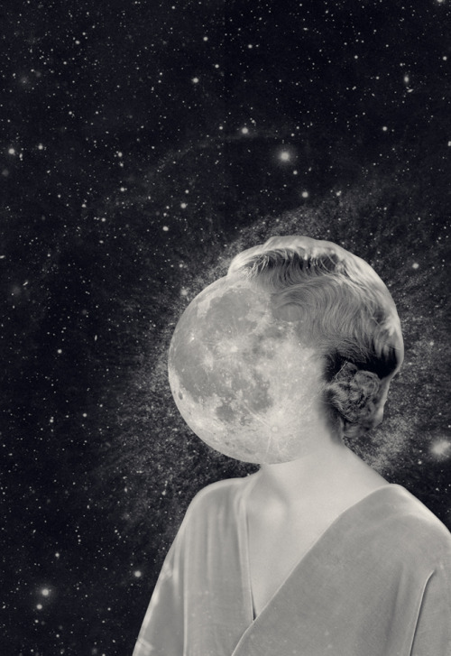
 by Steve Caplin

I really, really want to try sculpting realistically sometime in the future - soon.

These artworks inspire me because of the melodramatic poses and realistic contours - all of which contribute to very striking, emotional and thought-provoking pieces of surrealistic artwork.

I think in the current world in which we live (filled with whimsical, light artworks), there needs to be some artworks which actually evoke a poignant emotion in the viewer to lend the art scene some gravity. Thank goodness art has both.

I could use such inspiration in my works by producing very realistic and poignant artworks. I think I could learn how to depict human figures in my artworks in positions that evoke a stronger emotion in the viewer.


 By Nathan Stillie
This reminds me of Beilin's Rafflesia plant monster painting which she did for last year's EOY! It's in the same pose. It's hulking over some buildings. The resemblance is unexpectedly uncanny.


LED Street Arts by Ojo Señor
The eyes may be the window to the soul but no one who ever saw glow-y cat eyes in the middle of the night was doing too much contemplating. Ojo captures this more frightening aspect of eyes and turns them on with LED lights laced into his posters. It’s then plastered along the streets, his cat, children, and Poe eyes all the better to see you with…
Artist: Tumblr (via: meh.ro)

 This is an interesting thing to note, but very creepy. I think it draws attention to how the eyes greatly affect the way we see things.


Recently in my coursework I noticed something was not quite right with the eyes, and I went and changed it, and I think it made a world of difference - for the better. So yes, I agree with the artist's visual statement although it creeps me out....


“Content cannot be manufactured, in my opinion. That which I can find is better than that which you can make. That which we find, the work and the use of the people out there, it’s natural, that’s what ordinary people do, that interests me.”
Fred Herzog

This serves as inspiration for me because of the raw gem of a moment's surprise that is captured. There is a sense of rhythm and movement, and I like how the subjects who exhibit surprised expressions are the only women in the picture - and they are standing together - while on either side of them stand men whose expressions betray nothing much. I think that this is the essence of photography - to capture that moment of imbalance, that moment of emotions, etc.

There is also a very dramatic lighting in the photo, with pronounced light and dark areas (chiaroscuro).

I could use this as inspiration by looking more for such moments and bringing my camera about with me.

Christopher Anderson.


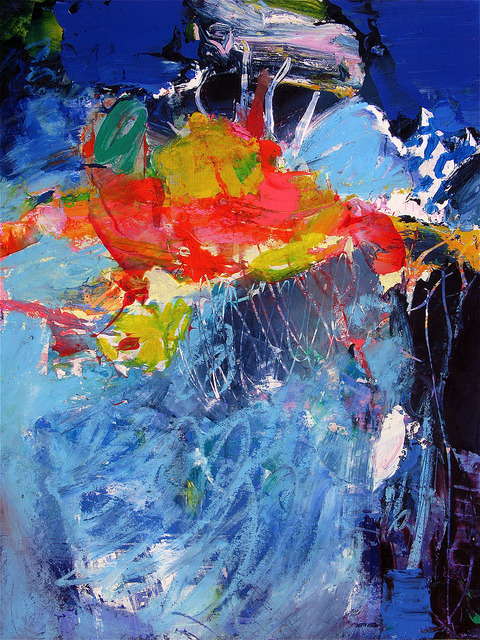
“Le Mauvais Génie” by stricher gerard

 I think this sort of art is good for the artist who has no time to paint but desperately needs some revenue. I mean, not to be scathing in my comments, but this is really honestly how I feel.

Such art certainly takes some getting used to. 

Actually after staring at this for some time I think the blue does have some therapeutic feel. This style of art probably provides some comic relief. Well it's good as it offers a greater variety of art.


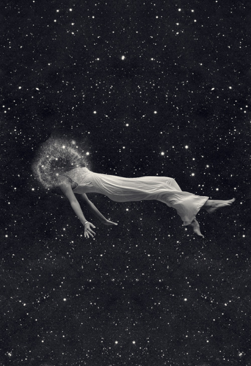
Pilar Zeta - Falling In Love With The Dark Side of the Universe
 How very Surrealistic. The photo above reminds me of Magritte.


DanteCyberMan
reblogged from Tumblr

This is exactly what I need right now for my coursework.

I'm seeking to depict waves, water around the human figure, and I need that kind of reflection above. This is an inspiration for how I should paint some parts of the water.

Sunday, 19 August 2012

As I was looking through my artworks I found something interesting.

Those who know me well know I like basketball. Throughout the years I've done drawings of guys dunking or shooting. I noticed some major improvements in the way I depict these human figures. Here are some milestones.

I did both artworks out of my imagination and artworks where I referred to photos. It's not fair to compare them, so I'll separate them into the 2 categories.

Artworks done from my imagination
Man Dunking Basketball
Lee Shu Hui
Pencil on paper
24 Aug 2007


Man With Basketball
Lee Shu Hui
Pen on paper
2010

As you can see, there is a major improvement in depiction of form. I would probably accredit it to reading the entire Slam Dunk series. The manga REAL, drawn by Takehiko Inoue (the same manga artist who came up with Slam Dunk), also played a huge role in igniting my passion for basketball and I always loved reading because of the wonderful graphics, emotional plot (father-son troubles and then reunions, friends, deep thoughtful words of meaning about life spoken by characters) and the games played within the pages.


Artworks where I referred to photos
They're up there, titled 1st to 3rd Basketball artworks.


Linkin Park Fan
Lee Shu Hui
Pencil on Paper
A3
June 2007

(click to enlarge if needed)
This may not be an accurate portrayal of reality, because I imagined this guy up and also his pose. The hands look realistic because I was looking at my own hands as I drew. Yes that was how Shuhui's hands looked back then hur hur. So back in p5 I was a Linkin Park fan. I'm way over them now. Oh an important point to note: That wasn't meant to be a tattoo. I'm not really for them. It was meant to be like a Photoshop-ish image of LP's logo; I was imagining it at the back of a CD cover or something.

This I include into the portfolio because it is one of the many practices that I had in the past trying to depict the human form. This one was more heartfelt as I wanted to express my like for LP and their music. Err but then again that was then and now is now.

I was very happy with the result because I wanted to depict a guy expressing his approval for music that he loves. I think there is a sense of movement that I successfully managed to capture in the drawing. Now in retrospect it looks like a rather blithe expression of teenage self-absorption.

I think I've changed a lot since then. :\


Paul
Lee Shu Hui
Pencil on Paper
2010

So this is Paul from Boys Like Girls. I chose to draw him solely because of the astonishing aesthetic qualities of his face. :B that's why all the details are only in his face. and I just skimmed through everything else. but then again, the popular cliches spring to mind: "don't judge a book by its cover" and "beauty is only skin-deep". I love the way he looks when he's singing - a very earnest look. I thought I should capture it down. So I put the video on pause and started drawing. Anyway I admire his Middle-Eastern exotic look. By the way that's him singing and playing the guitar. He's harmonizing with the lead singer.

A challenge I faced when drawing: The still of him was really small, because I was referring to the video on my iPhone. But with persistence, all challenges can be overcome.

This work shows evidence of my growth towards my goal (made when I was younger) to successfully depict the human form realistically because I think this drawing looks quite realistic. I mean, look at his face and ignore the other scribbles that vaguely depict form.

I think it's important to include this work in the portfolio because, as I'm painting the human face and form for my coursework, I should show some growth and practice from previous years in depicting the human face and figure.

One thing I learnt about myself through this work, after the sense of satisfaction I received at the end of it, was that I enjoy depicting the human form realistically and facing and overcoming the challenges of doing so.


Boy
Lee Shu Hui
Pencil on paper
approx 2 by  3"
 27 April 2011


This is a random boy that I imagined up. I wonder why people always ask me "Who's that?" when I draw anime guys because most of the time I'm just drawing random guys from my imagination. So this is a little sketch I did on foolscap paper. I set out with Pierre Morhange from Les Choristes (a wonderful French film, you can Google it.) in mind. The very piercing blue eyes and the serious look. So I focused more on the light falling into his eyes, the neutral way his brows are set, and the angle at which his head is tilted downwards, as though he is looking directly at the viewer, which gave him a very soulful countenance. I also drew his arm as leaning against something, emphasising spatial difference and thus implying that he is leaning forward, which makes his look a little more piercing.


This piece of work was done because I hadn't picked up my pencil to draw for several months or so prior to this drawing, so to prevent my drawing skills from becoming rusty I took the opportunity to do a drawing.


This work reflects my understanding of the form and structure of the human face.


I think I could have improved on this drawing by finishing it. But then again I hardly finish most of my sketches.


All in all, I am very satisfied with this drawing because it is aesthetically pleasing to the eye.

Saturday, 18 August 2012


Above the World
Lee Shu Hui
Pencil sketch
2010

About the Artwork
(the following art critique I did in 2010 was for our AEP SIA. We chose the theme Light, so I'm talking about how this work relates to our theme towards the end)
This artwork depicts a man standing on a narrow rectangular pipe, which could be stretching from one building to another. Below him, there are many buildings of different shapes and sizes, which show a cityscape. The people walking on ground level appear to be small dots. A linear perspective has been used so that the buildings appear large at the top and small towards the ground. The light source is coming from the top left corner of the picture, showing that the sun is beginning to set.

Contrast has been created through the differing intensities of light and shadows. Shadows have been made extra dark by using a 6B pencil, while the actual drawing was done using HB and 2B pencils, causing the pencil marks to appear much lighter. There is some sense of movement in the artwork, as from the direction in which the man's hair is blowing, one can observe that there is a breeze blowing from the viewer's right. Large rectangles, the tops of the buildings, have been placed around the man, to allow for eye movement around the artwork. Composition is rather balanced, as subject matter is not concentrated on any spot, but is evenly spread out. Emphasis has been placed toward the centre of the picture, where the man is. Beside the man, the side of the building not facing the sun has been made specifically darker, to draw the viewer's attention to the man.

This artwork is somewhat similar to Friedrich's Wanderer Above the Mists, although urbanized. The man stands alone, above a cityscape, looking down below at the happenings of busy city life. However, there is a sense of stillness in the picture, as there is little sense of movement but for the slight breeze, which shows the serenity the man is experiencing alone high up above the ground. This brings across a peaceful mood. Through this artwork the artist might be trying to portray that the man is fleeing from the troubles of a hectic life, and goes up to a quiet high place as a form of escapism. The dark shadows which spread across the artwork could mean that the darkness is threatening to overpower those on the ground level, who are still engaged in the bustle of a hectic life. Through this, the artist might be trying to say that having too busy a life would not be good for people, and that sometimes all we need to do is step back for a breather. This artwork could also show the serenity of being alone at times, bringing across a light peaceful feeling, and also shows striking contrast between shadows and light, hence connects suitably to the theme "Light".

How I Did It
 This is a pencil sketch through and through. I loved the urban feel of it, the way it's monochromatic and sketchy.

Why I Did It
This was actually based on a drawing I did in Pri 5, 2007. I admired the earnestness of the subject matter, of the pencil strokes in the drawing, so I decided to do a "reproduction" of the drawing. Originally the man was standing above a highway, but I decided that would be too unrealistic, so I changed it to a metropolis. When I drew that in 2007, I was very honestly trying to depict a place where one could be free to take a moment in the cool breeze, high above the ground, alone, to think, to see, to ponder, to be calm, to be at peace. Thus, I incorporated the same main subject matter, but changed the background.


I would have tried this style had I done the etching in clay that I originally set out to do for coursework.

Le Cercle Fermé by Martine Feipel and Jean Beachameil
reblogged from Tumblr

This is beautiful. I'm guessing it's Photoshopped. This is like a peek in the hallways, the reserves of the human mind. Although this person seems to have a whole lot of empty drawers.... Hmm.... (Just my interpretation.)

It reminds me of the stop-motion animations they used to play on KidsCentral (there's no longer such a channel on Mediacorp), because the surroundings were always distorted in some way, because they were probably constructed from plasticine or clay. I remember watching that as a child and I actually kind of disliked how it looked, how there was no smooth transition but instead jerky movements and unconvincing movement of the lips that didn't match the sounds that came out. I don't know why I now adopt a more neutral stance towards it. Maybe they improved it with the advancements in technology.


 (from hollyleonardson on Tumblr)

A simple statement, in all its frivolity and minimalism, in one of the emerging cultures of this age serves as an absent-minded reminder that society has evolved way past the cares and troubles of the days of the pick and shovel.

To me, art is a constantly amassing monument of history that marks out and characterises the passage of time. What would we do without art?


Childhood
Lee Shu Hui
Colour pencils
2010

About the Artwork
This artwork depicts a boy on a swing. A lollipop stick hangs from his mouth. Behind him, a yellow sun rises in a mild sky tinged with red. Beside the swing, a soft toy lies in a field of lush green grass. Toward the bottom right, the colours of the grass softly fade away in a mild Polaroid effect. The light source in the artwork is coming from the direction of the sun, which is diagonally behind the boy. Linear perspective has been used to create the illusion of the boy appearing closer to the viewer than the swings are.
Mainly warm colours have been used, like the shades of brown for the swing, the peachy skin tone of the boy, the vibrant yellow colour of the soft toy and the sun, the yellowish-green of the grass, and the red of the clouds and halo surrounding the sun. Pencil strokes are a mixture of rough and smooth, so as to bring out certain textures, like the roughness of the strokes for the boy's shirt, compared to the soft smooth strokes for the soft toy.

The striking bright red colour of the boy's shirt contrasts with the deep blue of his shorts. This striking contrast brings the viewer's eye toward the boy in the artwork. Also, the dark brown tones of the swing contrasts with the light blue sky. The ropes of the swing stretch upwards toward the top of the artwork, which allows the viewer's eye to travel around the artwork. There is a sense of movement in the artwork as a slight breeze appears to be blowing from the viewer's right hand side, which can be perceived from the direction at which the field of grass is bent towards. The boy's hair is also slightly ruffled towards the viewer's left, according to the direction of the wind. The composition of the artwork is not balanced, and concentrates toward the left. The boy and the swing dominates the entire left side of the artwork. This places emphasis on the boy, and what he is doing.

The lollipop stick in the boy's mouth might be showing the artist's impression of the sweetness of childhood, even as a lollipop is delightfully pleasing to the taste buds. The light breeze blowing could be portraying the artist's perception that childhood is gentle, and also could signify freedom. The two birds flying far off in the horizon also might show the freedom and lightness of childhood, as birds are lightweight, and fly freely in the sky. The soft toy lying in the grass could signify the innocence reminiscent of childhood.

This artwork is similar to the theme "Light" as it contains the sweetness, innocence and carefree-ness of childhood, which, in other words, portrays the lightness of childhood.

How I Did It
I did this with colour pencils.


Why I Did It

I wanted to portray innocence in childhood, a life devoid of care. I missed my childhood, and that brought me back, brought me to think about little children, led me to depict them and to imagine a place free. To just be free from all sorrow, all trouble - back when the hardship we knew was not the hardship to us now, and the joys of life were much simpler, when "the sun was shining" meant it was another day out in the playground, and when the world was viewed with eyes brimming with curiosity and not yet dimmed by dust.


The Hand
Lee Shu Hui
Charcoal sketch
2009

About the Artwork
(taken from my Feldman's analysis of it in 2010)
This artwork depicts a statue of a hand, clenching on to a cylindrical object, sitting on a plinth. The light source is coming from the top left hand corner of the artwork. The shadows are elongated. The statue of the hand is realistic.

The shadows have been made especially dark to contrast with the lit parts of the hand and the plinth. The pencil strokes are a mixture of rough and smooth, as the strokes for the background, which was done using charcoal, are somewhat rough, but the shadows, done using a mix of charcoal and pencils, are smooth. The rough background creates a rough, misty feel over the subject matter. Composition is balanced, as the subject matter is situated toward the centre of the picture.

Through this artwork, the artist might be trying to show that the things which we are attached to and cling on to are made beautiful in our own eyes, from our own perspectives, as shown from the light falling upon the cylindrical object, which could signify the things we are attached to. The artist might also be trying to say that we should truly treasure what we already have, as it is of much worth to us, as shown from the clenching of the hand over the cylindrical object, which could show the clinging on of the things which we already have. This artwork is related to the exhibition theme of "Light", as the artist portrays the hand literally bathed in light. This artwork also has a symbolic meaning, that we should always treasure what we have, and also showing our unwillingness to let go of the want for materialistic things, which in our eyes may be beautiful and hard to let go of.

How it was Done
 I ran over the paper with charcoal as a background. It was pretty hard to ensure a even layer was applied, even as I rubbed the charcoal longitudinally across the paper, because sharp edges of charcoal tended to get caught on the paper and would show as abnormally dark lines.

After that, the real work could begin. This piece was done during AEP lesson in 2009 when we were in Secondary 1. So I was sitting at the table where this sculpture of a hand was placed, with a light source shining onto it. I had with me a range of pencils from HB to very dark Bs (about 7 different tonal ranges), but as I recall I only used 2 or 3. I used the darkest ones for the outlining of the object, and an eraser to put in highlights on the object.

Why I Did It

It was for an in-class assignment in Sec 1, meant to train our ability to differentiate light and dark and to hone our artistic powers of observation I guess. Well because it was a class assignment I just did it. I was quite happy doing the pencil sketching because I'm rather familiar with that. Actually I'm quite regretful I didn't sit at the table with the Grecian-like sculpture of a man's face. I would have loved to sketch that kind of thing. I still do.


Lights Out
Lee Shu Hui
Watercolour, colour pencil and toothpicks on paper
2010

About the Work
(these following paragraphs, written in Feldman's method of art critique, were what I wrote back in 2010 from our AEP SIA blog)
This artwork depicts a building at night with some of its windows open and curtains drawn, revealing different people and families through each open window. All the figures have been cartoonised. One of the windows show an animated-looking figure speaking on a red telephone. Through the next window, an old man is resting on his couch in his bathrobe, staring at the television screen in front of him. Above the old man's room is a window with green curtains drawn back. Through this window, a boy is literally burying his head in a book, as the yellow book he is reading blocks his face entirely, so that only the top of his head can be seen. The window beside him shows a boy staring fixedly at his computer, his eyes wide, typing on the keyboard. A different window above shows a couple fighting and yelling at one another. At the window above them, a cartoon figure is hunched over a bowl of noodles, ready to eat his supper. The pots and pans hanging from the wall in the background behind him suggest that he is in his kitchen. To the right, another window at the top shows a cartoon figure kneeling on his bed, confiding in his soft toy. Subject composition is not balanced, but rather concentrates toward the bottom left side of the artwork.

Smooth shading of strokes using colour pencils have been used. Smooth brushstrokes have also been used to depict the pitch-black tone of the building. Colours used have been mostly cool colours, like black, which covers the whole of the building to show that it is night time. Warm colours have been added to create contrast in the picture, like red, for the mouths of the cartoon figures and for the curtains of the uppermost room at the right, purple, used for the old man's couch and the computer of the boy, and peach, for skin tones of the cartoonised figures.

There is little sense of movement in this artwork as the moving figures make up a small portion of the whole artwork, while most of the figures are stationary or seem to be moving very little.

Emphasis has been placed on the topmost right hand corner of the picture, where a lone window stands out amidst the blackness of the building and the surrounding windows. The curtains of this window are a striking mixture of bright and dark tones of red, which attract the viewer's eye towards it.

There is a repetition of squares throughout the artwork. These squares were formed by gluing toothpicks onto the paper. They have been placed uniformly side by side, depicting the steady goings-on of the night time. The artwork also has a rather flat perspective.

This artwork sheds "Light" on the lives of all these different people living together in the building. The artist's use of many windows revealing different people and situations could be showing the complexities of life, while the chosen setting of night-time and the use of black for the building could depict the darkness many face through the difficulties of life. The dominant use of cool colours, like black which dominates most of the artwork, and lack of a sense of movement in the artwork also creates a sleepy, stagnant mood which depicts the artist's opinion of a typical night scene in a residence.

How the Work was Done
I wanted to be creative in my choice of material by diversifying it, so I attached toothpicks with UHU glue to form little windows in rows of 3. I made sure they were uniform. I then used poster colours to paint the black background. Inside each window, I pencilled the drawings in before adding colours with colour pencils.

Why I Did It

I wanted to show how life is mundane yet complex. I wanted to show the multi-faceted personalities in each block of residential units. As I live in a residential area, I sometimes wondered what went on in other people's houses (those who were in the same and surrounding towers), and if I knew, would I feel like I knew them better? Would that engender a sense of compassion or understanding towards them in my heart?

I went on to imagine what people in other houses could be doing when tiredness sets in and people are home and they come back to their families or to an empty house. The mood was pretty mundane and depressing when I thought about it, partly because I did it at night and was tired out and feeling sombre, so I decided to use cartoon figures to create a sense of contrast to save my work from becoming overtly solemn. I also desired to have some contrast in what I did, seeing as most of the other 4 pieces of work I did for the exhibition are semi-realistic or realistic.

However, as I did the artwork I think life became slightly more mundane. But now after 2 years I look back and I realise my perspective on life has changed. I no longer look on it as a long tiresome stretch, but I try to take things one at a time. This change in outlook is also because of new hopes and aspirations that have emerged in the course of these few years, and new things about life that I have discovered. I am glad to see how I have matured in this respect, and I hope I will continue to mature in my outlook on life and how I live it.
This was an artwork I did way back in Sec 2. One of my first few attempts at realistic painting.


A Maze and A Mystery
Lee Shu Hui
Poster colour on paper
2010

About the Work

This painting shows a crystal ball emitting light in the midst of darkness. In the crystal ball, blocks of colour are put together, forming a maze. Above it is a pair of hands, held in the fashion of a gypsy foretelling the future.

Rough, choppy brushwork have been used to depict the subject matter. Composition is evenly spread out throughout the painting. Complementary colours, such as red and green, attracts the viewer's eye to the center of the painting. Striking colours linked to the red and green, placed toward subject matter around the crystal ball, initiate and allow for eye movement around the painting. Contrasting colours like black and white have been used, so that light in the painting will stand out to the viewer's eye. The hands depicted in the painting seem to be coming out of nowhere, due to the blending in of the upper arms to the background, which gives off a mysterious feel to the subject matter. The colours in the crystal ball are mostly warm colours, adding a touch of vibrance to the painting.

The artwork communicates a sense of mystery and a mix of emotions such as a distant coldness and, at the same time, vibrance. This is to symbolise the different aspects of light, where in the painting only a few perspectives have been given. The mysterious feel, achieved by the dark and murky background and the use of a crystal ball as a subject matter, could be an example of how alluring and magical light can be, while the maze of colours symbolises the many different uses and shades of light. Its vibrant contrast to the murky and dull background could suggest light in the form of revelation in the midst of ignorance.


How It was Done
That was done when I didn't have a camera except for my Nokia Classic-something (which is pretty useful and good in terms of vibrancy of colour), so I didn't refer to any pictures to sketch out the hands. I referred to my own hands by staring in the mirror. The good ol' primitive way. (just kidding.) Well, the way the light falls is consequently not very accurate - but that's the beauty of creative imagining.

Why I Did It
I was thinking about life, and how in times of darkness moments of clarity can appear to us, and we reach out with hands like the cold impoverished man to the fire. I also wanted to capture the way when knowledge first begins to distill upon our souls, and we approach it slowly, with wonder, like a little child, knowing the complexity of it, that it must be handled with care, and obtained.
For our AEP exhibition last year, I did our poster using Photoshop (:

it was a journey of discovery for me, one fraught with challenges, because I never use photoshop.

If I'm not wrong, this is the original poster, before the others edited it. (it was so long ago, I can't remember how it looked like before)