Thursday 20 June 2013

' "Singapore should not be behaving like a child and making all this noise," Agung Laksono, the minister coordinating Indonesia's response, told reporters. "This is not what the Indonesian nation wants, it is because of nature." '

Excuse me? This is a fallacious assertion.

First of all, our country is used to having reasonably clean air. This was taken away from us in just a matter of hours on Monday morning. That takes time getting adjusted too. Of course some Singaporeans would complain.

Secondly, the PSI shot up within less than a week to hit the nation's highest ever recorded PSI of 371. Talk about making history. We're told by the NEA that a PSI of more than 300 is hazardous. From a healthy PSI of 44 to a "hazardous" PSI of 371 in a few days? Now that's saying something. 

Thirdly, this is definitely not nature. Would nature spew minute ash particles and nitrogen oxides in hazardous quantities on our tropical island? Not in the last thousand years. But Man (yes, perhaps even some Singaporean companies) would burn forests illegally for the sake of monetary gain. The mess was entirely man-made, motivated by pure avarice. 

So if we're overreacting, Laksono clearly made little effort to see things from our perspective. Contrary to this behaviour, it is noteworthy that PM Lee did attempt to do so for Indonesia in his statement addressed to the latter. 

Lastly, I think some Singaporeans should stop blaming the government.  

Justneededsomewheretovoicemypoliticallycorrectopinions.


A quote from one of my favourite scientists who ever lived. He has a few other quotes that I feel aptly describe the world, science and the human condition. One of the most beautiful feelings I felt today was while being engaged in solving physics problems. #ilovescience (plus art)

I thus conclude that a light and airy room contributes to a satisfactory experience in the acquisition of knowledge.

I now bid thee adieu

Friday 14 September 2012

Salt Lake Temple
Lee Shu Hui
Pencil on Paper
2010

I felt moved upon to sketch this because of the lovely architecture of this building, which is in Salt Lake City, Utah, in the United States. Moreover, it is a symbol of my faith, built in a painstaking 40 years in the 1800s. Its architecture is full of symbolism, which I enjoy.

I've never been there, but people say it's a beautiful place. I did this piece of work with the thought in mind that I want to go there one day.

I referred to a picture of the temple. I did this with pencil on paper.

I think that this is a refreshing change as I hardly sketch architecture. I am satisfied with the precision of the sketch, which I achieved through using a ruler to help me sketch the straight lines.

My Coursework Progress


This was my progress. I made some changes along the way. Eg I originally planned for streaks of colour (Affandi-style) in the back ground, but ended up painting water. I don't have photos of the final- what it is right now - but here are some thoughts.
This coursework marked some firsts and seconds for me.
-First time using acrylic on such a large scale and so realistically!
-Second time using oils, first time on such a realistic basis, another first in terms of scale. (my first time painting with oils was that failed 18" by 24" experiment of that boy standing in the same pose as Svena (before I asked around for people to model in place of that boy) which I included in my prep boards, it's there for all to see how failed it was... That first left me very discouraged and kind of took away my motivation to paint with oils, so I happily took the challenge of painting with acrylics.) (By the way, the different lightings in the photographs are because I took them at different times of the day, and I leaned them so sunlight fell onto them, so naturally they'd look different on camera.)
this is the failed experiment. my very first time using oils. turned out so bad T T. I think it's because I had the wrong approach. So because I got discouraged I started doodling on the canvas.

By the way, I was attempting to jump straight into trying out a traditional painting technique - and probably that was too big a task I sought to undertake, which only led to disappointments and realisations that perhaps it wasn't as easy after all.

This failed tryout led me to realise I needed a model. Else how would I know how to paint the skin tones?? So then I started asking around... people said no... and finally Svena agreed.

Acrylics made it hard for blending. I didn't think it would be so hard with the Extender, maybe it was my technique. But after I switched to oils the change was so great - I could do a lot of blending easily and quickly, as opposed to the frustration of rubbing furiously trying to get tacky paint to blend. This made it easier for me, allowed for more versatility in the facial expression which consequently did not appear so stiff and dull as it had with acrylics.Oils gave the face a life that is unequaled by acrylics (at least for my abilities when I use acrylics. It just looked dead...) So yes after this liberating revelation I realised that oils, for portraiture, are much easier to work with.

One good thing about using acrylics as my base layer was that the oils formed a very smooth layer with minimal application of paint. And oils are more expensive than acrylics.

Portraiture calls for very serious and in-depth observational skills. Throughout the whole course of making this work, I had to constantly analyze what went wrong - constantly scrutinize the photograph and compare it with my painting and search for the problems. A very slow, very tedious process that took me weeks to muster - weeks of adjustments, adjustments and more adjustments, before I was able to understand how to paint Svena's eye properly in a way that made it look real enough. I hope my powers of observation have been honed slightly more through this vigorous mental exercise...


I wish I had more time to work on my painting, but since it's over, well that's my effort and I'm just glad I can finally concentrate on studying after all this.


Restoration
Lee Shu Hui
Photography
22 September 2010

I took this using my old Nokia handphone. It was a Classic 3120, but don't let the name deceive you - the camera was really good. I took this photo at Sharon's house during the hols or after school, I can't remember, because at that time I was really passionate about choir and I went to her house after school a couple of times to use her piano and we'd practice our choir songs. The sunlight looked really beautiful, and I felt awed staring into the sky which was before me, which stretched on and on and I couldn't see the end of it. So I ran and got my phone. During that time I was really into photography, really passionate, always using my phone to snap pictures around me whenever I thought something would make a good photograph.

This makes an inspiring photograph, don't you think?

Sunlight gradually distilling upon the tops of the buildings in darkness, like heaven opening its doors to reveal an endless outpouring of light.

95th Anniversary Birthday Card

Nanyang 95th Anniversary Birthday Card
Lee Shu Hui
Mixed Media
2012

To celebrate Nanyang's 95th birthday anniversary, we were tasked to produce some birthday cards for the school.

I thought that incorporating the school colours into my artwork would be pertinent, so here I included the school colours: blue and yellow (NY uses it in her school logo), and red and white (the colour of our hongzi uniform).

I did this work with colour pencils and poster paint. I was confident with colour pencils, as I'd spent countless hours working with them in Secondary 3 for my SIA - the kimono with the realistic pictures on one side and the abstraction on the other side, complete with Jackson Pollock-esque splatters against a black background. (It's one of the first few posts in this blog, so, to the reader- if you're interested, you can go search for it). So yes, I was quite in my element there. Although I could have improved it a lot better if I'd spent more time on it.

I first sketched out the slice of strawberry cake. Next I coloured over my pencil markings with colour pencils. I then diluted my poster paints in water to give the background that nice blue hue. However, I realised my birthday card looked too dull. I needed something more vibrant. So I turned to my poster paints, and surely enough the red of the strawberries turned out so much better. The sponginess of the cake was brought out so much more after I added some yellow ochre (by the way, prior to doing this artwork, I didn't know poster paints came in the same colour names (like Titanium White, Burnt Sienna, Yellow Ochre) that oil paints do!).

I then did the watermark style NAN YANG 95 with diluted red poster paint. I think the font could have been improved on. The Nan Yang was written rather crudely and was rather squarish like it is on our uniform, so I think I could have had better planning and honed my calligraphy skills... Like at least practice before I did the actual thing, like what Beilin did. So yes. Learning points for the future.

I actually decorated the back of the card too, but because I suddenly had this burst of artistic passion, and started working like an Abstract Impressionist, somehow things didn't turn out quite so nice-looking. -sigh- Thankfully it got covered up because that uglier side of the card is the one being stuck to the white standup board. Some of my friends had quite a laugh out of it.

Here is my preparatory work.


Igor Mitoraj
Dormiente (Sleeper)
2002

This was exhibited at ARTSTAGE Singapore. I think this is a lot like my style of drawing. Sharon also told me so, citing how I like to draw Grecian-like guys' faces from my imagination when we saw this work at the exhibition. However, I'd just like to clarify that I don't just always draw Grecian-looking guys.


Igor Oleinikov
Kunstrauber (Art Thief)
2011

This artwork also struck a great impact on me. It was one of the guiding factors (along with Chuck Close) that inspired me to produce my coursework on the human form being depicted realistically.

Sharon told me that this was a lot like my style of art. I just was very much attracted to this piece, staring at it for a long time.

It is not a perfect face, not an idealistic Golden-Ratio face as the ancient Greeks would have liked it; it has its flaws and imperfections, with the frown lines and the sunken eyes peering out from behind shadows and the eye bags. I admired how it was so impactful, so unfinished, yet so striking - there was a tinge of color that appeared to be spreading across his forehead in the shadows. He looks like an apparition of light, like a faraway dream, all solemnity, like a twist in the plot of LOST. The blurred sides of his face makes him look like he is receding into the light, or swallowed up by it.

I wanted very much to do something like this for coursework - an impactful view of someone, a face, looking up into the viewer's eyes. I did incorporate that idea into my coursework.


2nd Basketball artwork


Untitled
Lee Shu Hui
Pencil on Paper
June 2009

This was the second sketch I did in 2009 that was realistic and was about basketball.

This was done because firstly, I enjoyed sketching realistically. This was also because I had kind of failed in my attempt (see previous post) to depict Kobe Bryant playing basketball back on 27 May, so I had that urge to better myself and to try again.

This work looks better than the one done of Bryant in May. I think that this work shows a lot more comfortable, natural pencil strokes, compared to the 1st basketball artwork I did.
There is a sense of movement in the picture and I love how this work is unfinished, with the central focus on the NBA player with the ball as he is the one who looks the most complete and finished. The fact that it's unfinished as a whole also provides a sense of rhythm to the sketch - yet these figures are caught in time, still and frozen.

I think this piece of work shows how I improved in my rendering of the human form. I disagree that in order to learn how to depict the human form you have to look at the bare body - I think if you have an eye that is discerning enough, you will understand the form even when you analyze and draw the body with clothes on. I dislike the way in which certain professional artists opt to study the human form.

I decided to include this, among my other 2 basketball sketches which i have already posted, to show my progress from the first artwork to the second then to the 3rd most developed one. I think it charts my growth. Though it doesn't sum my whole journey, which hasn't ended yet, I think it helps to show one segment of how I improved artistically.

I think I should say sometimes some spark just comes to me and that helps me a lot. Sometimes the spark isn't there and I get an uninspired piece of ordinary work.

Thursday 13 September 2012

1st Basketball artwork

Kobe Bryant
Lee Shu Hui
Pencil on Paper
27 May 2009

This is the first of 3 series of basketball sketches I did in 2009. I felt quite dissatisfied after finishing this piece of work. It was one of those works where after you're done with it, you feel like you could do better and you feel like changing it but you feel like just taking a break from it for a while because you've spent so much time on it and you're pretty discouraged - the feeling is just not a nice one.

I was spurred on to sketch this picture of him from the newspaper that day because there was a nice long article about him and the previous day's game and how he was the star of that show. That kind of kick-started my fandom for Kobe Bryant, because all along throughout my childhood I had a passion (sometimes waning, sometimes strong) for basketball, although not necessarily having the talent nor spending enough time on it. I think I spent more time drawing than playing basketball. Let's just say I'm an amateur who's liked basketball most of her life.

This artwork does have its good points - I like the way the folds in his clothes were depicted along the chest area.

After this, I wasn't willing to give up so easily, so I did a 2nd sketch in June 2009 of an NBA player I didn't know - but Kobe is challenging him for the ball and failing. Will upload it soon.

3rd Basketball artwork

Kobe Bryant
Lee Shu Hui
Pencil on Paper
approx A3
14 November 2009

Kobe Bryant is awesome!!!!

This piece of work is meaningful to me because I'm a fan of Kobe Bryant. I started reading about him in the sports column of the newspapers in 2009. So this was done when my fandom was at its peak. I still admire him a lot though.

One point I'm not satisfied with is how I drew a very resolute thick line near his shoulder, which to me kills the realism of it all. But i can't change it anymore - considering how my sketchbook got thrown away.. and all that's left are the digital remains of it... ): r.i.p. One thing I struggle with is - when an artist has signed the date on the work, wouldn't going back and changing it later on compromise the integrity of the date written there? But then again, doesn't the artist have the discretion to change the work if it belongs to her and her alone?

I think I have a deeply rooted strength in sketching. But very humbly I acknowledge that there are still points for improvement in my technique, and perhaps I may never attain to the greatest perfection in pencilwork in the near future but perhaps practise may help me.

I remember depicting the muscles on his arms were tricky, because in the picture there wasn't really a distinct line - yet there were faint lines on his arms that were slick with his perspiration. (this sounds gross) I didn't really want to colour his arm and erase in the highlights, so i just used lines to represent the muscles on his arm. If I were to do this work now, I would approach sketching the arms in a different manner - I would be making softer side-to-side brushstrokes into the paper.

This piece of work was exciting for me because this was the first time (I think) I'd ever sketched in such a delicate style before - like a milestone I'd reached in artistic achievement. (Usually, in those days, my style was rough, hard pencil strokes. Sketching anime guys helped me with learning to sketch softly) Prior to this - or during this time - I was really into manga, so I didn't sketch realistically for a really long period of time. Instead I sketched manga guys. Before attempting this work, in May and June (this artwork was done in Nov) I sketched Kobe Bryant from pictures I found. The growth in my ability from then to here in November is astounding. I'll upload them to show the change.

Monday 20 August 2012


 by Steve Caplin

I really, really want to try sculpting realistically sometime in the future - soon.

These artworks inspire me because of the melodramatic poses and realistic contours - all of which contribute to very striking, emotional and thought-provoking pieces of surrealistic artwork.

I think in the current world in which we live (filled with whimsical, light artworks), there needs to be some artworks which actually evoke a poignant emotion in the viewer to lend the art scene some gravity. Thank goodness art has both.

I could use such inspiration in my works by producing very realistic and poignant artworks. I think I could learn how to depict human figures in my artworks in positions that evoke a stronger emotion in the viewer.


 By Nathan Stillie
This reminds me of Beilin's Rafflesia plant monster painting which she did for last year's EOY! It's in the same pose. It's hulking over some buildings. The resemblance is unexpectedly uncanny.


LED Street Arts by Ojo Señor
The eyes may be the window to the soul but no one who ever saw glow-y cat eyes in the middle of the night was doing too much contemplating. Ojo captures this more frightening aspect of eyes and turns them on with LED lights laced into his posters. It’s then plastered along the streets, his cat, children, and Poe eyes all the better to see you with…
Artist: Tumblr (via: meh.ro)

 This is an interesting thing to note, but very creepy. I think it draws attention to how the eyes greatly affect the way we see things.


Recently in my coursework I noticed something was not quite right with the eyes, and I went and changed it, and I think it made a world of difference - for the better. So yes, I agree with the artist's visual statement although it creeps me out....


“Content cannot be manufactured, in my opinion. That which I can find is better than that which you can make. That which we find, the work and the use of the people out there, it’s natural, that’s what ordinary people do, that interests me.”
Fred Herzog

This serves as inspiration for me because of the raw gem of a moment's surprise that is captured. There is a sense of rhythm and movement, and I like how the subjects who exhibit surprised expressions are the only women in the picture - and they are standing together - while on either side of them stand men whose expressions betray nothing much. I think that this is the essence of photography - to capture that moment of imbalance, that moment of emotions, etc.

There is also a very dramatic lighting in the photo, with pronounced light and dark areas (chiaroscuro).

I could use this as inspiration by looking more for such moments and bringing my camera about with me.

Christopher Anderson.


“Le Mauvais Génie” by stricher gerard

 I think this sort of art is good for the artist who has no time to paint but desperately needs some revenue. I mean, not to be scathing in my comments, but this is really honestly how I feel.

Such art certainly takes some getting used to. 

Actually after staring at this for some time I think the blue does have some therapeutic feel. This style of art probably provides some comic relief. Well it's good as it offers a greater variety of art.


Pilar Zeta - Falling In Love With The Dark Side of the Universe
 How very Surrealistic. The photo above reminds me of Magritte.


DanteCyberMan
reblogged from Tumblr

This is exactly what I need right now for my coursework.

I'm seeking to depict waves, water around the human figure, and I need that kind of reflection above. This is an inspiration for how I should paint some parts of the water.

Sunday 19 August 2012

As I was looking through my artworks I found something interesting.

Those who know me well know I like basketball. Throughout the years I've done drawings of guys dunking or shooting. I noticed some major improvements in the way I depict these human figures. Here are some milestones.

I did both artworks out of my imagination and artworks where I referred to photos. It's not fair to compare them, so I'll separate them into the 2 categories.

Artworks done from my imagination
Man Dunking Basketball
Lee Shu Hui
Pencil on paper
24 Aug 2007


Man With Basketball
Lee Shu Hui
Pen on paper
2010

As you can see, there is a major improvement in depiction of form. I would probably accredit it to reading the entire Slam Dunk series. The manga REAL, drawn by Takehiko Inoue (the same manga artist who came up with Slam Dunk), also played a huge role in igniting my passion for basketball and I always loved reading because of the wonderful graphics, emotional plot (father-son troubles and then reunions, friends, deep thoughtful words of meaning about life spoken by characters) and the games played within the pages.


Artworks where I referred to photos
They're up there, titled 1st to 3rd Basketball artworks.


Linkin Park Fan
Lee Shu Hui
Pencil on Paper
A3
June 2007

(click to enlarge if needed)
This may not be an accurate portrayal of reality, because I imagined this guy up and also his pose. The hands look realistic because I was looking at my own hands as I drew. Yes that was how Shuhui's hands looked back then hur hur. So back in p5 I was a Linkin Park fan. I'm way over them now. Oh an important point to note: That wasn't meant to be a tattoo. I'm not really for them. It was meant to be like a Photoshop-ish image of LP's logo; I was imagining it at the back of a CD cover or something.

This I include into the portfolio because it is one of the many practices that I had in the past trying to depict the human form. This one was more heartfelt as I wanted to express my like for LP and their music. Err but then again that was then and now is now.

I was very happy with the result because I wanted to depict a guy expressing his approval for music that he loves. I think there is a sense of movement that I successfully managed to capture in the drawing. Now in retrospect it looks like a rather blithe expression of teenage self-absorption.

I think I've changed a lot since then. :\


Paul
Lee Shu Hui
Pencil on Paper
2010

So this is Paul from Boys Like Girls. I chose to draw him solely because of the astonishing aesthetic qualities of his face. :B that's why all the details are only in his face. and I just skimmed through everything else. but then again, the popular cliches spring to mind: "don't judge a book by its cover" and "beauty is only skin-deep". I love the way he looks when he's singing - a very earnest look. I thought I should capture it down. So I put the video on pause and started drawing. Anyway I admire his Middle-Eastern exotic look. By the way that's him singing and playing the guitar. He's harmonizing with the lead singer.

A challenge I faced when drawing: The still of him was really small, because I was referring to the video on my iPhone. But with persistence, all challenges can be overcome.

This work shows evidence of my growth towards my goal (made when I was younger) to successfully depict the human form realistically because I think this drawing looks quite realistic. I mean, look at his face and ignore the other scribbles that vaguely depict form.

I think it's important to include this work in the portfolio because, as I'm painting the human face and form for my coursework, I should show some growth and practice from previous years in depicting the human face and figure.

One thing I learnt about myself through this work, after the sense of satisfaction I received at the end of it, was that I enjoy depicting the human form realistically and facing and overcoming the challenges of doing so.


Boy
Lee Shu Hui
Pencil on paper
approx 2 by  3"
 27 April 2011


This is a random boy that I imagined up. I wonder why people always ask me "Who's that?" when I draw anime guys because most of the time I'm just drawing random guys from my imagination. So this is a little sketch I did on foolscap paper. I set out with Pierre Morhange from Les Choristes (a wonderful French film, you can Google it.) in mind. The very piercing blue eyes and the serious look. So I focused more on the light falling into his eyes, the neutral way his brows are set, and the angle at which his head is tilted downwards, as though he is looking directly at the viewer, which gave him a very soulful countenance. I also drew his arm as leaning against something, emphasising spatial difference and thus implying that he is leaning forward, which makes his look a little more piercing.


This piece of work was done because I hadn't picked up my pencil to draw for several months or so prior to this drawing, so to prevent my drawing skills from becoming rusty I took the opportunity to do a drawing.


This work reflects my understanding of the form and structure of the human face.


I think I could have improved on this drawing by finishing it. But then again I hardly finish most of my sketches.


All in all, I am very satisfied with this drawing because it is aesthetically pleasing to the eye.

Saturday 18 August 2012


Above the World
Lee Shu Hui
Pencil sketch
2010

About the Artwork
(the following art critique I did in 2010 was for our AEP SIA. We chose the theme Light, so I'm talking about how this work relates to our theme towards the end)
This artwork depicts a man standing on a narrow rectangular pipe, which could be stretching from one building to another. Below him, there are many buildings of different shapes and sizes, which show a cityscape. The people walking on ground level appear to be small dots. A linear perspective has been used so that the buildings appear large at the top and small towards the ground. The light source is coming from the top left corner of the picture, showing that the sun is beginning to set.

Contrast has been created through the differing intensities of light and shadows. Shadows have been made extra dark by using a 6B pencil, while the actual drawing was done using HB and 2B pencils, causing the pencil marks to appear much lighter. There is some sense of movement in the artwork, as from the direction in which the man's hair is blowing, one can observe that there is a breeze blowing from the viewer's right. Large rectangles, the tops of the buildings, have been placed around the man, to allow for eye movement around the artwork. Composition is rather balanced, as subject matter is not concentrated on any spot, but is evenly spread out. Emphasis has been placed toward the centre of the picture, where the man is. Beside the man, the side of the building not facing the sun has been made specifically darker, to draw the viewer's attention to the man.

This artwork is somewhat similar to Friedrich's Wanderer Above the Mists, although urbanized. The man stands alone, above a cityscape, looking down below at the happenings of busy city life. However, there is a sense of stillness in the picture, as there is little sense of movement but for the slight breeze, which shows the serenity the man is experiencing alone high up above the ground. This brings across a peaceful mood. Through this artwork the artist might be trying to portray that the man is fleeing from the troubles of a hectic life, and goes up to a quiet high place as a form of escapism. The dark shadows which spread across the artwork could mean that the darkness is threatening to overpower those on the ground level, who are still engaged in the bustle of a hectic life. Through this, the artist might be trying to say that having too busy a life would not be good for people, and that sometimes all we need to do is step back for a breather. This artwork could also show the serenity of being alone at times, bringing across a light peaceful feeling, and also shows striking contrast between shadows and light, hence connects suitably to the theme "Light".

How I Did It
 This is a pencil sketch through and through. I loved the urban feel of it, the way it's monochromatic and sketchy.
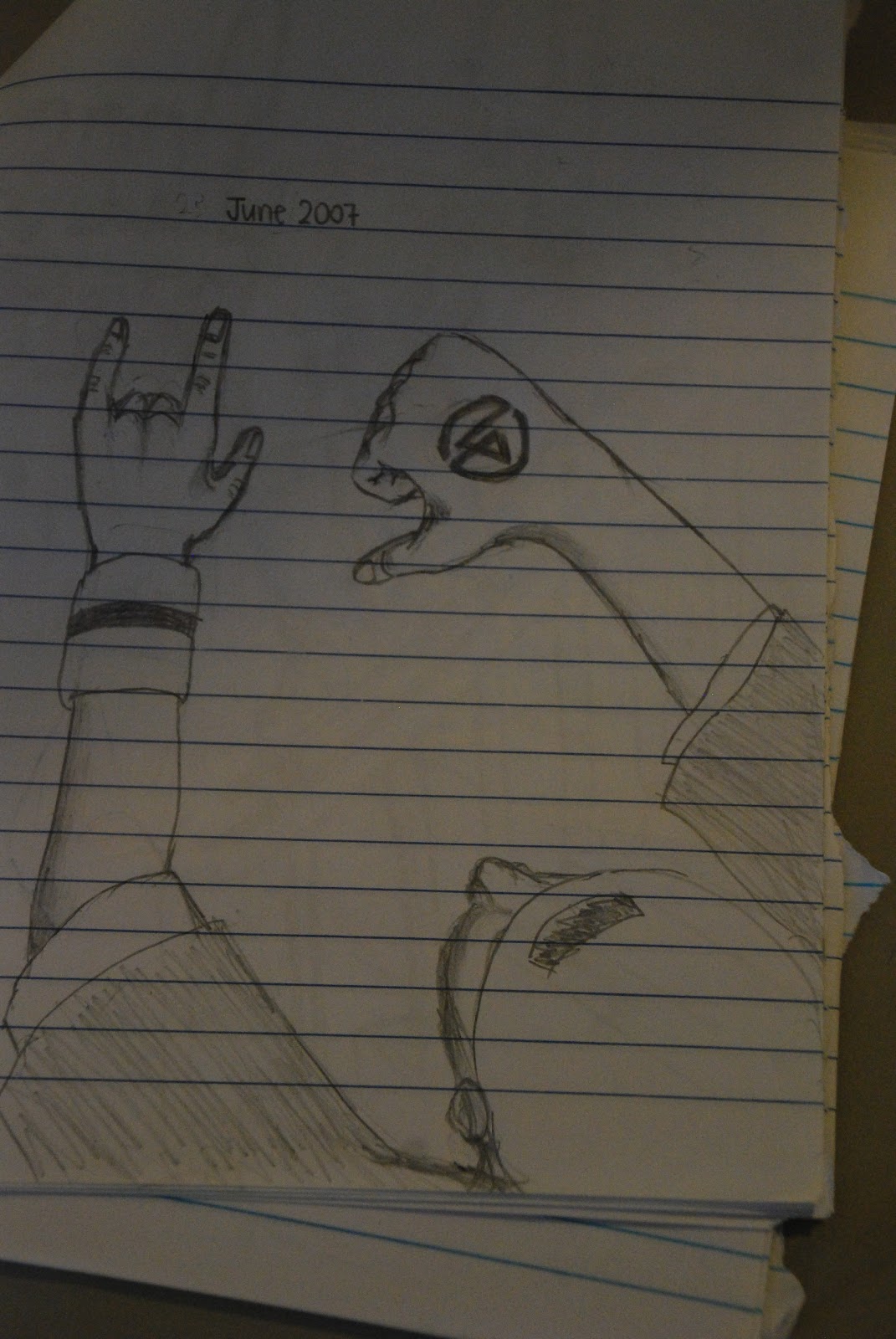
Why I Did It
This was actually based on a drawing I did in Pri 5, 2007. I admired the earnestness of the subject matter, of the pencil strokes in the drawing, so I decided to do a "reproduction" of the drawing. Originally the man was standing above a highway, but I decided that would be too unrealistic, so I changed it to a metropolis. When I drew that in 2007, I was very honestly trying to depict a place where one could be free to take a moment in the cool breeze, high above the ground, alone, to think, to see, to ponder, to be calm, to be at peace. Thus, I incorporated the same main subject matter, but changed the background.


I would have tried this style had I done the etching in clay that I originally set out to do for coursework.